Ancillary Task

Our second task was to research on any UK music magazines that are still printing to this day. I managed to find quite a few, however, in reality, it looks like the music magazine industry will be gone soon enough. Researching further, I noticed that many magazines are now offering their copies digitally because of the lack of sales that have dropped dramatically in the past few years.
The last task was to complete some research on UK music magazine sales of 2014. Unfortunately, I found some data that was recorded in 2013, but the drop in sales was greatly visual. I found out that for Mojo, the number one best selling music magazine in the world, had 79,345 average circulation for each issue, however, year-on-year, this number drops by 6.8%.
I found out further information on Mojo's reader. These figures recorded in 2014 show the age range in percentage as well as gender. We can see that males are a common customer to the music magazine compared to the females ratio. However, if we look at the age range, we see that although with 24% teenagers are second placed as the most common age group to read Mojo magazine, however adults are ranked first place with 28.8%. This not only shows the target market of Mojo, but also shows that although teenagers and young adults are expected to read this genre of magazine, they are probably enjoying the information via web instead.

 |
| A collection of some recent publications |
Existing UK Music Magazine Research
Our teacher had brought some print versions of contemporary music magazines to look at and help us decide on the right media product for promotion. The variety was mixed, and there were certainly magazines that would definitely be the wrong place for my chosen band, and others managed to challenge my decision.
 |
| The front cover features Kaytranada who focuses on bringing house, hip hop and R'n'B into his works. |
Mixmag is known as the world's biggest dance music and club culture magazine. Although the age range of this magazine's target audience is similar, their interests differ. Where my typical target audience prefer underground live gigs, this magazine is based on music that is often played in crowded clubs. Additionally, the type of music that Glass Animals produce isn't something you could dance to at a club, and I think promoting it at Mixmag would't attract enough attention from the readers of this magazine as the genre of Glass Animals' works isn't something they'd be interested in.


When looking through the magazine, one section that really stood out for me was an article dedicated to Fabric XV, a UK's leading club that turns 15. The article features a good-quality photograph of a crowded club and modern-looking text in white to contrast against the atmosphere of the background. Along the bottom is a row of some DJ's that decided to share their best moments at the club. I would definitely not expect Glass Animals to be quoted amongst the group as it is not the type of focus in their career.

The back cover of the magazine includes another advertisement, promoting, once again, a club-based artist (as expected). The design is limited yet captivating. The bold red in the background seeks attention amongst its target audience. The bold black and white of text are visible from afar, and, in fact, very noticeable when viewing up close. The codes and conventions may be hinting gore, however, the design looks modernised, such as the skull on the flag. The symbol has been limited to just a white circle with two black dots for eyes and a somewhat white knife going through the head. The flag silhouettes against the red with hints of grudge behind it to give it a rough look. The selection of font seems modern and club-focused, screaming a DJ atmosphere.
In conclusion to Mixmag, it is not the kind of choice I should be making for my band. My target audience would be most likely avoiding this type of music magazine and wouldn't think about dance clubs every weekend as they'd prefer less crowded live gigs of their underground artists' performance.
Power Play is a magazine dedicated to rock and metal-based artists. Skimming through this magazine, everything was related to rock and metal artists, just as expected. I did not find any artists that differ from this genre, which already shows that this type of magazine isn't the place to promote Glass Animals.
The cover features a portrait of Amy Lee (known as Evanescence's lead vocalist). The mise-en-scene in the cover reflects on the rock-based lead singer. The bold black eyeliner around her stare to match the black shade of her hair messily tied up compliments the magazine's focus on rock and metal music.
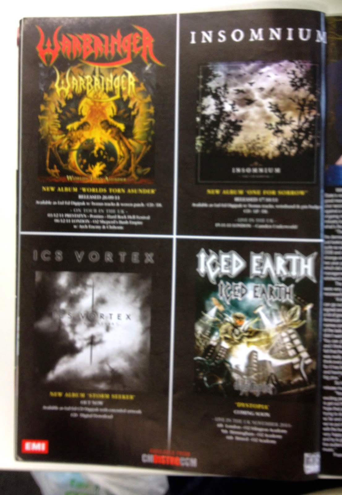
There were a few pages of advertisement promoting bands of rock or metal-focused works. One of the pages included 4 albums on a page to promote their works. Looking at the design of the album art, they all scream metal or rock. The darkness is spotted in all four designs to reflect the mood of the music. Some contain gothic illustration to comply with the depression or horror that the music brings to the audience. The use of font further proves the associations with death, for example Warbringer's logo. The font appears masculine and pointy, almost threatening the viewer to show that only those who have no fear can come upon the album, or even dare to listen to the music. The use of red signifies blood, and if we look closer to the letter g, the curve appears to mimic death's scythe. Their logo is reflected on the album in yellow, keeping the exact design for greater recognition.
I wouldn't expect my band to be promoted amongst these type of artists because the genre of music is completely different and is targeted towards a different kind of audience. Where the atmosphere is aimed to be dark and almost threatening, my band produces music that tends to put its audience in a laid back position and allow them to enjoy the music and relax at the same time, and by following rock and metallic-based artists' codes conventions will not give the right impression of my album to my target audience. It would need to portray the right mood to reflect on the type of music the listener is expecting.
A magazine I was going to choose to promote my band originally was going to be NME. Surprisingly, I came upon this article published in February the 14th, 2014. this was fairly recent, so I decided to have a read. The article stated how NME's music magazine's sales have dipped below 20,000 copies a week, hitting their lowest sale. According to ABC's circulation figures, it's stated that the 62-year-old publication sold an average of 18,184 per issue, concluding to 21% of a drop from December 2012 (when each issue sold around 23,000 copies). It has been said to drop every year since 2009, despite few relaunches.
Melody Maker, NME's greatest rival in the music institution, closed in 2000 when their circulation dropped to around 32,000.
Although the circulation figures are unappealing to the businessmen, Jo Smalley (NME's publishing director) told BBC that the magazine was not in danger of closing at all, as the circulation data are ''part of a much bigger picture, which is what NME is doing as a brand''. The music magazine has seen an increase of 49% of advertising revenues over the past 12 months.
In addition to this, NME's official website receives 1.4 million users per week, and sells each week 1,307 digital copies a week. Furthermore, thousands of people are still seen to attend NME's live events and concert tours.
Nowadays, many like to approach NME digitally, however some still enjoy the hardcopies, and Jo Smalley ensures that he reaches his customers both ways.
 I realised that to subscribe to NME's magazine, it is cheaper to subscribe to NME digitally rather than to the physical copy (most likely due to delivery costs included in the price). This could be another reason to the downfall of hardcopies sales. Either way, it is much more of a fuss to get your hands on a hardcopy as this needs you to make your way to a store that sells the magazine. Alternatively, the digital copy is published weekly, which only ever needs updating before you can access the product.
 Although its downfall of sales may put me off from choosing the magazine to promote my band, I think that it fits best to Glass Animals. I believe that because Glass Animals is one of the more rarer genre-based bands, and NME supports multi-genre music, especially underground artists, and I think that Glass Animals could be promoted here. Additionally, NME used to have their very own radio station, which I used to listen to online, however, a few years ago they had to shut it down due to lack of interest from their audience. However, I believe that from the varied music they played, I think Glass Animals would fit amongst the multi-genre music community.
I also found out that on NME's official website, they had featured Glass Animals' 'Zaba' album, and I think to get the audience's notice further would be to promote the band on the front cover of NME.

Additionally, referring back to my research on Harvest Records that Glass Animals are signed upon, I noticed that Kasabian, who also had their latest album 48:13 signed up by this record label, had their tour of their album advertised at the beginning of NME's latest issue that I purchased to look at.
 I think that Kasabian, who had their album 48:13 and tour featured within NME shows that Glass Animals would also fit in with the magazine, partially because these bands both have similar target audience, and the fact that I would expect my target audience to also enjoy Kasabian's music.
I searched for a media kit of NME, and discovered this PDF file, which briefly introduces the company, features some figures and a specification. This document is for promotional use to draw customers' attention and promote their work through NME's weekly magazine. They mention few statistics to show their success as a music-based company. With this information, the customer is informed of NME's performance as a physical print magazine. The contact information is also given so that the customer can refer to the company if they're convinced with the press kit. The costs of promotion are also listed as a menu so the customer understands what they're paying for. The specification aids them with the expectations NME requires to be met.


Melody Maker, NME's greatest rival in the music institution, closed in 2000 when their circulation dropped to around 32,000.
Although the circulation figures are unappealing to the businessmen, Jo Smalley (NME's publishing director) told BBC that the magazine was not in danger of closing at all, as the circulation data are ''part of a much bigger picture, which is what NME is doing as a brand''. The music magazine has seen an increase of 49% of advertising revenues over the past 12 months.
In addition to this, NME's official website receives 1.4 million users per week, and sells each week 1,307 digital copies a week. Furthermore, thousands of people are still seen to attend NME's live events and concert tours.
Nowadays, many like to approach NME digitally, however some still enjoy the hardcopies, and Jo Smalley ensures that he reaches his customers both ways.
I also found out that on NME's official website, they had featured Glass Animals' 'Zaba' album, and I think to get the audience's notice further would be to promote the band on the front cover of NME.
 |
| Also, their album review was published in one of NME's issues, which hints the fact that they fit this multi-genre music community. |

I searched for a media kit of NME, and discovered this PDF file, which briefly introduces the company, features some figures and a specification. This document is for promotional use to draw customers' attention and promote their work through NME's weekly magazine. They mention few statistics to show their success as a music-based company. With this information, the customer is informed of NME's performance as a physical print magazine. The contact information is also given so that the customer can refer to the company if they're convinced with the press kit. The costs of promotion are also listed as a menu so the customer understands what they're paying for. The specification aids them with the expectations NME requires to be met.

Research: Conventions of Music Magazine Advertisements (MMAs)
Now that I have chosen my magazine, I decided to have a lot at a range of artists that promoted their album through a magazine advertisement. I wanted to have a look at a few that differ in target audience and genre of music to see how they have used their codes and conventions to advertise their work. I also thought it will give me a better understanding of what is expectant of a music magazine advertisement and I will hopefully find some inspiration when it comes to designing my own promotion of my chosen band Glass Animals.
 |
| When we look at the design, it looks rather complicated. The manipulation of the four band members amongst an eagle gives slight confusion tot he eye, however the hints of band members in each square gives it a look of mystery. Although the band has given away some of its identity, they still remain somewhat secret. The use of green in the photograph gives it an appeal of being taken by a night vision-specified camera. Additionally, the symbols of framing laid out accordingly gives it a sense of looking through the camera lens. To support this technology-focused theme, the titles of the band and their promoting album are presented in the style of a computerised font, how the lettering is straight and square. I believe that the lower dashes between the lettering connotes a computer file. Usually, when naming a file, there is no allowance to the use of spaces, and instead are replaced by these _ _ symbols. I conclude that the use of this transfers the atmosphere onto a computer system, so the customer is viewing the design like it was on a computer screen. The use of capital lettering also makes it stand out against the photograph. Band's title and album name being separated by the image and colour give it better recognition to the band. Additionally, the fact that the band's title is in white and placed atop of the design makes it easier to recognise as it differs from the photograph's colouring and is also most likely the second thing you see when you look at the design, photograph being the first. Furthermore, if we look at the dashes at the top, they have been coloured in with a blue pen, a colour where no where else throughout the design has been used. It makes it stand out against the fixed colour scheme and also drags attention towards the name for greater recognition to the band's title. I also think that the fact that they have been coloured in by hand makes it somewhat look more personalised by someone, which gives it a somewhat personal appeal to it. Another use of different coloration can be identified in the OUT NOW text towards the bottom of the design. The use of red in this sustained-font notice attracts more attention as it contradicts the use of green and blue once again. In doing so, because of its placement at the bottom, it also receives better recognition amongst the rest of the information located at the bottom. The customer reading this notice will be notified quickly when glancing upon the poster as the contrasting colour stands out to the eye. The album includes 3 of Kings of Leons' successful tracks; Use Somebody, Sex On Fire and Crawl. Some of these songs were at the top of the charts in its time period, and by notifying these popular tracks to the groups of customers will most likely attract not just the band's target market, but also those who grew liking of their songs. This may lead to customers purchasing the songs due to the fame of these tracks and perhaps will grow liking of the rest of the track list, which may earn more fame to the band. Additionally information includes where the album can be purchased, band's official website and record labels. This information is placed at the bottom as it's importance at being recognised first isn't the greatest. By doing so, the elements, such as the text of the band's title and their album, and the designed image are first witnessed before drawing down to look at the extra information. Generally, the image, artist's title and album name act as a hook so they capture the customers' attention before informing them with the rest of the information necessary to the customer. In this case, the use of colour remains according to the colour scheme; green and white. All elements have been aligned centre to follow the division of the photograph. Overall, it gives good coordination amongst these elements that work together to promote the band. |
 |
| I happen to own a few of their CD's (I'm somewhat a fan of Kings of Leon); Come Around Sundown (2010) and Only By The Night (2008). As we can see, the design between the CD and the magazine are the same, differing only by the layout of the elements, most likely due tot the different format they had to work with to advertise. However, sustaining the same codes and conventions between the two shows clear connection and customers can identify the band quickly as they can relate to either when they see the design used on both of the media products. |
 |
| Plan B is an English rapper and songwriter. Looking at his magazine advertisement, although it follows the conventions, this album The Defamation of Strickland Banks differs massively when compared to Kings of Leon's Only By The Night promotion. They both seem to lack colour, however the portrayal is different. In this magazine, it follows a retro-like style as originally in the album the artist is sat below an old-looking cinema sign wearing the same suit combination as in the photograph featured in this poster. The photograph is black and white to support the attempt of old age within the design. Furthermore, the microphone held by the artist is also vintage. However, the retro style being conveyed through this design somewhat contradicts to the usual rapper's expectations. However, because music has developed into many different branches of music people of the past could never imagine, the combination of rap and retro that Plan B works with has formed into his own unique type of music. Looking further into the photograph, the choice of lighting seems to echo the positioning of the text; it is almost as if the white bold text of the album's title is shining on the artist. This definitely gives a comfortable view to the customer as the alignment of these elements appear logical. Within the black space, the text is aligned on the left, opposite of the photograph to give a sense of balance. Additionally, some information is shaded in white to contrast against the background, such as the album's title and reviews quoted from music magazines and newspapers. The style of font is sustained throughout the design so that the elements show connection between the information and appear organised as an overall advertisement. The title of the artist Plan B is placed, once again, at the top of the poster. It is important that the advertisement shows a good first impression, and looking upon the advert, one of the things you suddenly realise is the title and the artist; commonly, these take up a lot of space in many music magazine advertisements as they're both the ones that make up the artist. The lettering is in large scale so that it extends to the dimensions' width. Generally, the text looks controlled and clean, which could be echoing the style in which the artist is portrayed, such as the clean suit and haircut. |
 |
| Bombay Bicycle Club is an indie band of four members. I decided to look at their magazine advertisement to see how they use the conventions of a music magazine advertisement. Additionally, because they lean towards the underground community of artists, I would expect my target audience to enjoy their works along with Glass Animals. The poster follows the conventions of a music magazine advertisement; artist's name, album's title and an image along with additional information about the album being promoted. Straight away, we can identify the artist's title printed the largest out of all the information. The font is clean and the alignment of the text follows diagonally while the text is kept horizontal for easier reading. The lines that form a rectangle along with the text shows some order amongst the design. Additionally, I conclude that Bombay Bicycle Club has their logo branded like so due to the common use amongst their works, such as later albums (A Different Kind Of Fix - 2011). This way, they make themselves more identifiable because of the constant use of the same styled title that stays memorable in many customers and target audience. Below is the album's title. This time, although the font is the same, the lettering is somewhat scaled down. Perhaps because the title is so long, they wanted to fit the title within the width of the poster, which caused the text to take up a few lines. However, we can tell this information apart from the artist's title and the rest of the information below due to the capitalisation of all the letters. Furthermore, bolding the text gives it extra attention when compared to the large, somewhat skinny lettering of the and's title, or the rest of the information. The fact that the album is titled I Had The Blues But I Shook Them Loose has the design interpreted some of its meaning. Such as the mentioning of the colour blue, they applied this to the text to help it stand out against the black and white photograph. I'm uncertain of what the photograph is actually of, however the composition of it allows certain information to stand out. Such as placing the band's logo where most of the white area is makes it differ from the rest of the information as this was placed on the darker area of the photograph. This way, the information is separated from each other to serve its purpose efficiently. In addition to this, I also noticed that the people in the photograph appear to be looking up at the information, which may create a pleasing effect to the alignment and the atmosphere as there is some sense of connection between the elements within the design. However, I know that the artists aren't featured in the photograph, but remaining their identity a mystery seems like a typical trend amongst underground artists. They rely on their logo for recognition. Perhaps they're not as confident with their true image, however I believe that, like many indie artists, they don't play the role of being people who people look up to, but rather appreciate their work. The fact that the OUT NOW bit of the text is also in bold highlights the importance of the notice. When customers view the advert, they will know that the album is out on sale at their moment. Additionally, the advertisement lists some of the tracks listed on the playlist to leak some information on the album. Mentioning their most successful tracks on the album will earn more attention as they'll be identified by more people because of the popularity of these works. The styling of the text is, yet again, sustained the same to give it a sense of control within the layout. Additionally, the information has been aligned centre to balance the elements and form a connection amongst them. It also improves the aesthetics of the design, and may be more pleasing to its customers. The rest of the information is featured along the bottom of the advertisement. This is the least important information on the design, which earns them the least attention-seeking area of the canvas. However, in doing so gives the rest of the information more focus and they become more effective as they're the hook of the design. |
 |
| Here is another Bombay Bicycle Club's magazine advertisement. Although it is advertising a different album, there can be many elements identified that are similar and/or different from both. Instantly, knowing the band's logo used from the previous advertisement we see it again within this design. Although they're promoting different albums, we can see the connection between the two, and can draw certain conclusions about the band. Another thing that is noticed with the band's name is that it is placed at the top of the poster, making it one of the first few information gathered from the advertisement. Such as the lack of band's identity, we have the use of biology-related illustration promoting the band. We meet the same use of font styling and common capitalisation of entire text, excluding the band's title for greater notice. The elements are balanced due to the centre alignment. However, there has been extra information mentioned this time; reviews. Previously, the advertisement didn't include any reviews of their work, however it may be that it was their primary release. Now that we look at this advertisement, we can draw to the conclusion that Bombay Bicycle Club have some fame as they have been noticed by these many music magazines and newspapers. As well as being shown the amount of stars the album has received, with this information, it also tells us a bit about how successful the band is, which may promote them to indie-based fans that may not have come across Bombay Bicycle Club before. The colour scheme isn't as limited as before, perhaps due to the illustration and hints of pattern within the silhouettes that makes it somewhat more attention-seeking than the previous one. The dominating purple allows the cream and white-coloured information to contrast against this. Like before, the rest of the information is capitalised for separation from the band's title. Although they lack some attention, capitalising the text's style balances the share of attention amongst the elements. |
Here, I found a TV advertisement of Bombay Bicycle Club's album. As we can see, the concept of biology-inspired illustration has been continued on from the CD album art, to the magazine advertisement, to this TV advertisement. By doing so, it improves the identity of this work, and if people grow liking of the band when viewing this advert, the constant use of the illustration enhances the patterns in the audience's mind and makes the overall design more memorable. So, the next time they go shopping, they may visit a music-based shop and will know what to look for if they ever decide to purchase A Different Kind Of Fix.
 |
| The Drums is another indie underground band, probably few floors below Bombay Bicycle Club. I would say that due to their unique style, I would assume that my target audience is similar to theirs, so analysing their music magazine advertisement will give me an idea of how the codes and conventions have been used (or challenged) to appeal to their customers. Looking at the photograph first, there is a shot of some blue curtains with some old wooden flooring seen at the bottom. It already screams a vintage feel in the image alone, which can make the target audience draw conclusions of, perhaps, an old-fashioned band, or maybe along the lines of indie. The choice of lighting to glow from left towards the right side highlights the creases in the curtains, adding further age to the image along with the worn-out wooden flooring. Although we are shown no hint of band's identity, the assumed stage could be significant to the band, and the reason for them sharing this location may help others form a closer, more personal connection. The band's title, as expected, is located at the top of the magazine advertisement. The alignment of the text is common for The Drums to stylise it this way, and in doing so within the advertisement sustains their identity as artists. The title is printed in largest letters amongst the rest of the information - something that is very common amongst many music magazine advertisements. By doing so, upon our first glance, primarily we are noted who is being advertised. Beneath it, the band's name is followed by the album's title, The Album (also known as The Drums). Being placed underneath makes it the second most important piece of information. And now that the audience has gathered this, they draw their eyes on the reviews. These are often summarised in star ratings out of 5 with its source. We see that the album has been reviewed by newspapers, such as Daily Telegraph, as well as music-based magazines, such as MOJO. By featuring these, audience might just happen to be the readers of these newspapers/magazines, and knowing that their read has reviewed the album may help them draw their attention to it as it may come to their liking. Other information that doesn't need as much paying attention as compared to the rest of the text featured within the poster is placed away from the focus of the design, towards the bottom. Referring back to the photograph, the more significant information is placed on the blue curtains, where all the theatre work is hidden. Its as if this information is put on the spotlight. Whereas the official website, or the record label, these are dropped on the old, wooden flooring, proving its lack of necessary focus. Generally, when we look upon the poster, observe it as a hole before reading from top to bottom, and if the target audience is really interested in the promotion, they will continue on reading 'til the end, most likely those who seek additional information. |
 |
| Once again, for the CD cover art, we see the old stage with worn-out wooden flooring and the blue curtains. However, the photograph is taken from a slightly different angle. This way, sustaining the location, they have kept the ideal props within the photo shoot, and featured the band's/album's title in their typical style. Additionally, the lettering has been placed in a way that makes them pop out due to the odd angle they have been put at. Additionally, 'the' bit of the text is placed further, although it appears to hover above the word 'drums', so that they achieve to mimic the usually styling of the band's name. This use of illusion may draw some confusion to its viewers, however it will stand out in its odd way. Additionally, the lighting has remained the same as in the photo shoot for the magazine cover. Once again, the light source is coming from the left, enhancing mostly the back of the text. This way, it creates a similar effect to a halo, or perhaps mimicking the concept of a performance on stage by putting the band's title on the spotlight. |
 |
| Looking at the music video of Best Friend that is included in the album The Drums, we can see that although most of the video is based on the band performing in a yellow-tinted room, towards the end we see the concept of the blue curtains we have come upon before, such as the music magazine advertisement and the CD album cover. The curtains act as an ending for the performance, taking the opportunity to credit everyone involved in the making of the music video and the album. |
"Flip" Glass Animals Completed Music Magazine Advertisement for NME Magazine

For my music magazine advertisement, I was able to use the illustration like I did for the CD digipak product. Because the format for this advertisement is the same as the A4 scale of the graphic, there were no changes necessary to be made to set up the background.
The structure of the elements is the same as for the CD digipak in the sense that everything is aligned along the centre of the page. I wanted to continue this sense of control in the design to echo the order set in the objects placed on the table in the graphic. As well as that, I think that it also looks more appealing to the eye and puts the audience at ease when viewing the advertisement. Furthermore, I think that naturally when reading the product we will start from the top and read downwards, and I think that with all of the information lined up along the centre it will make the reading easier as the transition of the pieces of text flow smoothly.
I located the decor at the top of everything as an entry to the design. It is almost like a welcome matt at the doorstep, and I think that it acts as a nice invitation to the customers. I think that it also adds decoration to the information elements as everything else that is decorative is in the background, and I think that with this piece located at the top gives the information too some sense of art.
I wanted to have the album's title larger than the band's name as I want the audience to focus on this and memorise this information. This will also explain why it is positioned in the centre of the entire advertisement so that all eyes are drawn to it, and that the customers are notified of what is being advertised clearly.
Once again, I wanted these to feel like they're hovering above the art, so I added some shadows behind them. Even if this effect is hardly noticeable, I think that there is still some sense of embossing within the design.
I decided to feature some feedback that was given on the actual album. This information will give customers a brief understanding of the quality of the media product, who may not be too familiar with the band. This has been presented in smaller lettering so that it's nothing that the audience can still look forward to because when they're scanning the advertisement, they then come upon this information and might be encouraged with its rating from the NME magazine and one of NME's workers' quote.
I wanted customers to know that the album is available for purchase already, and provided this information by including an 'OUT NOW' set of text beneath the feedback. I layer out this information in this order because when the customer is looking at the feedback, the next thing they acknowledge is the fact that the product is available for purchase, and they may already be convinced by the ratings and may wish to buy the album.
I followed this up with some places where the album is actually sold, so that if the consumer decides to buy the product, they can continue reading on to find out where exactly they can make their purchase.
I think that I could have improved this area in the design by using the logos of the companies that are listed. This way, I believe I would have eased the customer's reading as well as made it easier to recognise the companies as they're very well known by their logos. However, this may have become an issue if these companies decide to update their logo. For example, a few months ago before the update, the iTunes logo was a blue-based design. Now, the logo has been changed in colour to an orange/red based design, and by featuring the logo it may cause reprints to update the version of the advertisement as the design may become outdated if the company does decide to change their logo.
It may also cause the customers to question the magazine advertisement, as they may believe that it might be outdated and unavailable.
Last but not least, I featured the record labels that were involved in the production of the album for the band (Wolf Tone and caroline). These are places where you can find out more about the album, and because the official website of the band relates, I also included the address.