The first disc records, ones that we would recognize as such, appeared around 1910. Most often these were packaged in plain brown Paper or cardboard sleeves. Occasionally and enterprising retailer would print his store name on the sleeve but generally they were unadorned.
 |
| Shellac Disc, invented in 1897, were easy to store and cheap to manufacture. These played at a range of speeds, containing just a few minutes of audio on a 7 inch disc. Larger discs had longer playing times - these were later introduced, such as 10 inch in 1901, 12 inch in 1903, until 78 revolutions per minute became the usual speed. |
 |
| Set of paper sleeves holding together by a single binder, with space dedicated to note the contents of each disc. |
 |
| Shellac discs were very brittle. This disc was broken when being gently cleaned. |


 |
| Disco DJ, Tom Moulton, and engineer Jose Rodriquez created the 12 inch 45 R.P.M. single, which sounded richer and fuller in comparison to the old 7 inch of the same recording. The wider spacing and deeper grooves on the 12 inch that make the pulse of the music is visible to the naked eye. |
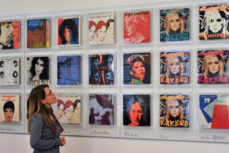 |
| Andy Warhol's 69 album covers displayed at Grassi Museum in Leipzig, Germany |
 |
| Album art by Frank Frazetta |


Although, most of the time, today we get to enjoy our most favourable music on almost any technology any household holds, such as smartphones, computers and television. However, vinyl copies are still trendy amongst some artists, although these are usually underground-genre musicians.
 |
| Need Your Love (2013) - The Temper Trap |
As much as the campaign was focused digitally, and the importance of creating static visuals caused them to bring the artwork to life in film. Producing a combination of few shots of slow-moving ink being dropped in water as moving images were employed in the iTunes LP as the first ever moving lyrics booklet. This hooked the hypnotic video up to 800,000 hits on YouTube.
Boat Studio took responsibility for directing the creativity dedicated to launching and promoting the single and album for the band; from 7-inch picture disks and Deluxe Casebound albums to the beautiful triple Gatefold, double coloured vinyl LP (long play).
 |
 |
 |
 |
Research: Album Covers Codes and Conventions
Ever since Alex Steinweiss invented the art of album covers, artists have been able to take their listeners on an audio adventure due to the visual representation. I have decided to have a look at the trends and dissimilarities amongst some of the most iconic album covers.
Looking at the range of album covers that are out there, many, if not all, consist of the three conventions; Artist's name, album's title and an image. However, as the media industry keeps developing, the album art has also underwent the impact, which has caused these conventions to be broken.
 |
| Highway To Hell (1979) - AC/DC |
The title of the album is also featured in capital letters, stretched vertically ever so slightly to give the font a character that is reflecting on the band's genre of music. In addition, the text is at the bottom, making it closer to hell, connoting the highway leading to this destination.
The band members themselves appear together, nevertheless, the order of the members positioned within the photograph shows each musician's status. Additionally, the main vocalist is dressed in horns with his devil's tail in his grasp. This further suggests their relation with rock and how it can be associated with hell. The expression worn on the vocalist emits an a lost punk-like feel. But with the member on the far right of the album, he appears smiling by his members, perhaps revealing the cheekiness side of the band in comparison to the other three members. Because the size of the text is rather small, it allows the imagery on the album to dominate the design.
With the three conventions well-thought through and summed up results to an overall effect the album has on its consumers; emitting a pure rock glow.
 |
| Abbey Road (1969) - The Beatles |
Additionally, there is no tight positioning of the members as they all formed a row for equal status. Its a photograph that rises many questions, such as Paul McCartney smoking and walking barefoot, out of step with the others. However, it has been said that with this clue and amongst others are all supporting the ''Paul is dead'' rumour.
The photograph is almost ironical, with the vehicles Beatles in the background. This may replace the need for the title as it is all visualised within the photograph itself.
With its originality, it has become one of the most imitated album covers in history, drawing numerous of other artists and bands to create their own versions of this cover. In fact, it has received so much fame that Abbey Road has a live webcam of its own, where everyone can re-live the moment captured in the photograph.
 |
| The White Album (1968) - The Beatles |
However, The Beatles had taken the road down to simplicity before with their The White Album, released in 1968. The cover consisted of nothing but a solid white background with the band's name aligned just off-centre. The album's sleeve was designed by a pop artist named Richard Hamilton. He and Paul McCartney collaborated to produce the basic cover art. Vinyl records were released in the US with the title printed in grey rather than embossed like on the original album sleeve.
 |
| Bad (1987) - Michael Jackson |
Looking at Michael Jackson's one of the most iconic albums from his collections, we see all three album cover conventions displayed on the cover art. We have the artist's album title, his own name as well as the Michael Jackson supported with these titles.
The album's title Bad is featured in a font that, when looked at closer, has a hint of graffiti style to it. This brings out the 'thug' aura from Michael Jackson, who is eyeing his viewer confidently. The text is printed in red to further imply what the word is trying to convey. It's positioned close to Michael Jackson's face, almost eye-level, and is overlapping the Michael Jackson text posed on the right edge of the design. This lettering is black and bold to really bring out the contrast against the white background.
The artist himself is dressed in black and metal accessories, giving the customer a hint of the type of music that they can listen to on the playlist. The black connotes his name, which is also printed in black, forming the link between the two conventions. He is making direct eye-contact with the viewer, creating a personal, perhaps threatening, connection. The white background supports the contrast of the artist, who looks relaxed with the pose he's in, displaying his confidence.
The album contains one of the most important songs, also titled 'Bad', where, in the music video, we can see how the cover of the CD links with the same bad concept portrayed in the media product. The mise-en-scène of Michael Jackson is seen identical both in the cover design of the CD and the music video. The concept is promoted through the CD, and in the music video, it is visually portrayed.
For his promotion in the Rolling Stone magazine, the same photograph is used for the cover as it is in the design of the CD case. Although, during the photo shoot, the artist was said to be impatient with the photography, and the production team ended up with limited shots, however, it just proves how iconic the unexpectant outcome has become. Although, perhaps because of the limitation to the collection they had from the photo shoot, the photograph has been used so many times that it could explain how it made its way onto the 50 most iconic album covers.
We have the repetitive use of black, white and red echoed from the album's cover in the magazine's design, somewhat acting like a straight-forward promotion as soon as the customers lay their eyes on it in a shop. All medium products, music video, album cover design and the magazine promotion relate to each other that create similar impact on the audience as the artist gains fame.

Like Highway To Hell, both artists' albums contain the three conventions, however the way these are displayed differ, which manage to deliver different messages with the different choices made for the certain conventions.
Album Covers: Research Into Existing Products

In this task, I was challenged to look at the conventions amongst 6 random CD cases that I was given and compare each design to identify the differences and similarities. I have noticed that many CD front covers contained the three codes; album title, artist title and an image. However, there were a few that outnumbered themselves from the conventions as they excluded featuring the album title on the front, or an image of themselves.
At the back, very few included the album title, however all 6 featured their track listing to show their customers what songs they're paying money for. I think this is one of the most important conventions when it comes to CD cover designs as it implies the function of the CD. I have also realised that some lists are numbered, and others even include the length of each song, giving extra detailed information on each track to their customer.
I have also noticed that all CD's featured their barcodes at the back as this location is the most comfortable when scanning the product. It is also the most convenient as usually all the credit and record label is also featured here as this information is similar to each other but would not fit well anywhere else. They're kept away from attention to give the artist the most focus from it's customers.
All spines on the CD's included the artist's name and album's title. I think the reason for this is to make storage much more comfortable as they can be stacked like books and are easy to find when looking through the collection.
The inside back is usually where the CD is placed. This often features an image, however because some of these CD's are still very outdated, the plastic might not be see through but solid black, so there is no need for decorating the area behind the CD. This is why we found that only 2 of the 6 CDs had images here.
The inside front usually features additionally information, like a booklet that includes lyrics, credits etc..
In general, I have discovered that each unique style between the designs are carried all the way through the entire CD case. They all manage to link to the original idea, and tend to reflect their genre of music onto their viewer, so they can reflect back on the feeling they get that the product emits and whether or not they should buy the music. Each design gave out different feelings when viewing them, but all managed to carry out the same type of information.
So, I have learnt quite a few things about CD cover designs, such as the importance of track listing as this feature has been identified in all 6 CD case designs. I have also noted the fact that they have kept their design throughout the case to present the information professionally and maintain the link between the parts. I will be focusing on these conventions and will ensure to apply these to my CD design so that I get the best, positive impact from my customers and manage to promote my chosen band successfully and professionally.

 |
| The front cover of the album contains nothing but a photograph. We can only guess that it features the band members. The fact that the design doesn't include any text information, such as the artists' title or the album name could show that the band isn't promoting themselves but want to create a personal connection with their fans instead as it will be recognised only by those who know Edward Sharpe and the Magnetic Zeroes very well. Alternatively, by going against the usual 'artist image + artist title + album title' tradition, the artist can hope to only draw attention to their customer because they're unsure of the artist and will be likely to pick up the media product to look for the information on the artist. The photograph's quality doesn't look at its best, probably because it was taken with a regular film camera for the vintage effect. Additionally, we can draw conclusions of what genre the artist plays. In this case, we would guess something along the lines of indie to folk music. The fact that the band members are all featured together holding onto each other against the sunlight can suggest their very close relationships amongst them. |
 |
| The back of the CD includes another vintage-looking photograph. Again, the band members are featured together, still with little identity shown. The idea of the silhouette is continued to balance out the idea. However, this time the photograph is black and white, giving it some contrast against the previous photograph. The bar code and small print are aligned along the left towards the bottom cover to give more appeal to the photograph. The playlist is aligned on the left too, I assume for the fact that there is little going on when we look at the photograph so that no information overlaps the silhouettes of the band. The font is handwritten with navy colour. It is neither numbered or given its length in seconds and minutes. The simplicity is sustained throughout the front and back design. I guess this creates an impact of wanting to know more, which could perhaps draw in the customer and make them purchase it to find out more about the artist. |
 |
| The inside back of the CD includes a plastic mild template where the CD is stored. If you remove the CD, you get a white circle implying the CD's shape with credit mentioned in purple text. The text is small so that everything fits well within the shape. It is all centred for better appeal to the customer. The colour is purple to match the design behind the white shape. The decision of using purple even though there is yellow too proves that purple stands against white better than yellow. I think if the yellow was to be used for the text instead would only let the white consume the yellow, making it irritable to the eye. The spikes representing the sun from the previous front photograph is interpreted with the yellow and purple triangular shapes behind the white, assuming that that is the sun. |
 |
| The CD design is also purple, matching the sun rays behind it. The font for the band's title hints folk to the customer. The Edward Sharpe & part is printed in silver-looking material, and The Magnetic Zeroes is printed in bold, western-style font to interpret their genre of music. The track list is also mentioned on the CD so it is more convenient for the customer when about to place the CD in the player as they're reminded of the order of the songs. These follow the combination of the title above; western style font in silver. |
 |
| On the inside front of the product, we get another photograph of the band. This time, it contradicts the silhouette idea amongst the other two used on the outside of the cover. Although, the photograph has been edited to give it a hint of pop art to match the use of yellow and purple. The yellow looks like a radiant that eventually fades into a white; this could be interpreting the hot climate of Los Angeles' roads they have travelled upon. Within the photograph, you can see the band members sitting closely together on an old-looking bus. I assume its their vehicle they travel on through Los Angeles as its something they do quite often. They're all looking towards the right, as if to give the effect of them eyeing the CD stored on the right of the packaging. The members are worded above the photograph in white text against the darker yellow. Their first names are capitalised, and their role within the band in small lettering. I believe that the fact that only their first names are specified allows their fans to bond with them more personally as they can refer to them by their first names. This list is also centred to align along with the bus. This is also a pocket, which stores a folded poster of the band members taken with a film camera. Unfortunately, I have this posted on my wall in my bedroom, so I can't share it. |
I believe that the vintage feel to the album has been followed by one of their most successful works, 'Home'. This music video, filmed with an old camera, demonstrates the band members' strong bond amongst them, especially the relationship between the lead pair Edward and Jade.
Research: Album Artwork
I decided to gather a range of CD cover designs that I believe are somewhat similar to my chosen band's genre of music. I wanted to find out what is currently on the market and see how these artists promote their own music through their unique code and conventions. I have noticed that many of these seem mysterious with the use of images, how some choose to not reveal their identity, or perhaps show it but in an unusual way. Although some go by the expectations of what information a CD case should contain, some manage to challenge these expectations as underground artists tend to be experimental or more clever with their ways of promoting their work.
Decoding An Existing CD Digipack


Research: Record Label 'Caroline'
Caroline sparked from one of the successful Label Services EMI division, forming a 30-year long historic Caroline distribution. The company is a full-service partner to the independent label and artist community within the music industry, creating a definition of a successful service company for artists and labels such as ATO Records, Dine Alone Records, Hopeless Records, Welk Music Group, Mute, Slash, Tyrese, Raekwon, Five Finger Death Punch, Alter Bridge, etc.. Due to its growth in business, they now extended their services to providing areas such as branding, synch, promotion, marketing, online and tour publicity.
For artists such as Smashing Pumpkins, Hole, White Zombie, Ben Folds and the Chemical Brothers, caroline continues to dedicate its abilities to help develop independent artists so that they can reach their maximized potential.
By looking at the record label responsible for Glass Animals' latest full album, I can see what other, similar genre artists caroline has previously worked with. I think in doing so will give me a better understanding of the expectations the audience have of the record label, and I think it will set me a clearer goal to producing my media product more successfully and fit for my aim.
On one of the pages, I can browse through recent releases, as well as upcoming releases, where front album covers are listed. Although some differ in genres, many seem to go for the artistic flare, where the artist themselves isn't featured on the front, or promoted in an interesting, or odd, way. There is a range of methods how messages are being implied within the cover art, dragging their target audience through mystery and curiosity rather than admiration of the artist themselves.
I decided to look at the listed album covers and made a tally chart of the elements I can find amongst them. Here is what I found out;

I found that many do not feature artist's image, and that the designs tend to portray their meaning through visuals of art or photography. I also noticed that a few didn't include artist's name, album's title, or any text at all, completely relying on their imagery. In some cases, this was in reverse, grabbing their attention with bold artist name or whatnot.
The second record label that guided Glass Animals is Harvest Records. HR is a leading record label (since 196) owned by the Capitol Music Group, originally formed by EMI. It was originally created to market progressive rock music.
In 1970s, post-punk groups began to sign up to Harvest Records, artists including Wires, The Saints and The Band. Iron Maiden's first three albums were also released under HR in North America.

I decided to do the same task as I did for caroline records. I looked up at HR's recent releases and found a similar layout that I could screenshot and work on. I went through the same process by analysing each cover design and tallying up their elements. There were 27 album covers in total.

Very few album covers featured the artists' true identity. The fact that their identity is kept a mystery could be there for a reason; perhaps get their audience closer to their work and form personal connections rather than the artist themselves. Although these are just my assumptions, but this seems to trend commonly amongst underground artists.
There are often subliminal messages behind the art of the CD cover, hinting the description of the kind of music the customer can hear on the CD. At other times, the type of music is being visually portrayed entirely by art in hope to set the right mood for the audience (e.g. Arthut Beatrice - Working Out). And out of the ordinary, you will find plain-designed covers, often those who try to seek for attention or very well-known artists (e.g. Kasabian - 48:13).
The target group is similar, almost identical, to my chosen band Glass Animals (I can reassure myself further by understanding that these artists are signed under the same record label), and by observing how the elements of a CD cover are portrayed towards these audience will guide me to promote the band successfully.
Research: HMV
However, I noticed a vinyl section of contemporary artists. These included The XX, The 1975, Arctic Monkeys, and so on. I believe I could relate to this area of artists as we're all focusing on the same target market. Although the product vinyl copies are different to what I'm working on in this project, the design of the cover has been kept unchanged for the CD version. Very few of them feature a photograph of the actual artist. Many have promoted themselves graphically or artistically. Some are designed somewhat simple, take Arctic Monkeys' AM album for example; the cover consists of a plain black background and white sound waves. Although it is very minimalistic, it connects to their successful music video 'Do I Wanna Know?'. After the fame, it is definitely recognisable.

Fortunately, I own The 1975 CD version. If we look at the cover art of the CD version, and compare it with the vinyl design, the art has not changed one bit. The theme is sustained. I chose to look deeper into this CD design because The 1975 have a similar target audience to my band's Glass Animals. I thought by doing so will give me a broader understanding of what is expected of this similar audience-based music product design cover. Additionally, I would expect my target audience to listen to this band too.
 |
| Their characteristic rectangle is visualised in this black and white photograph with their title within the rectangle in a retro-looking font. |
 |
| The CD is stored on the inside back of the product. The plastic casing has been moulded for the CD to fit in well so that it can be removed by using small force. The design of the CD follows the black and white theme, and the artists'/album title is printed in glossy surface in the same style as the one previously seen on the front cover. |
 |
| On the inside back cover, where the CD is stored, there's a photograph of one of the members spraying out the recognisable rectangle with graffiti. Although the photograph isn't black and white, the colour use is limited, following the lack of colour within the design. We don't get to see the face of the band member within the photograph, which remains the mystery of the artists' identity. |
 |
| The back of the CD contains the same rectangle from the previous photograph. Instead, the shape is occupied by the playlist of the album in similar glow-like appeal but more readable font. The list is aligned in the centre for a balanced design. The fact that the rectangle is seen in the same environment as the one placed on the front cover gives the effect of us viewing it from both sides; its front and back. The bar code and small print are placed on the right side, vertically, so it is out of the way of where most of the attention is drawn towards. Once again, the complete design is black and white. |
 |
| On the front back, we have a booklet. This booklet includes the front cover design we see when we first lay our eyes on the product, lyrics to the songs within the album on top of photography that blends in with the theme of the design; limited colour, almost grayscale mysterious-looking works, including a photograph of all four band members. The text font is simple in white, small so we can focus on the photograph and enjoy the work, but large enough for the lyrics or credits to be readable. They're aligned either on the left or right side, placed towards the bottom corner so that more is seen of the photograph. |
 |
|
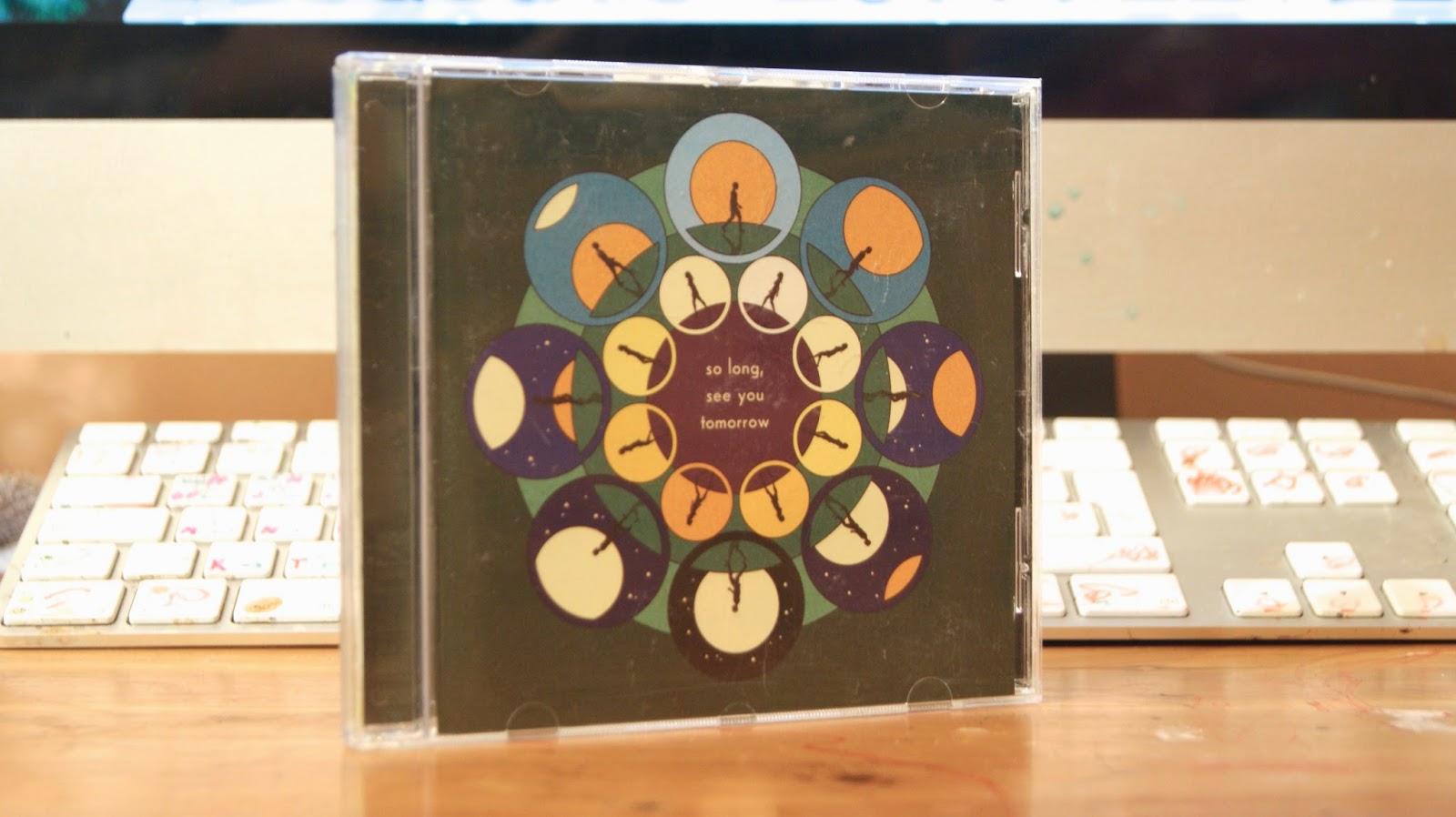
The outside front of the CD art includes an
illustration done by La Boca. The title of the album is printed in the centre
of the illustration; so long, see you tomorrow. The fact that most grammar has
been ignored may be an attempt of creating the mood personal as most often you
talk or write comfortably amongst your closest friends.
The art is illustrating two people; a male
and a female. They're silhouetted, which keeps their identity a mystery. We see
them walking around the centre either away from each other or towards each
other. I guess this can interpret the changing of longing for each other. For a
moment, they're walking away, and the next they're coming back. Furthermore, I
think it also implies on the title of the album; looking closer at the detail
of the illustration, each circle differs in time of day or night, which
interprets the fact that they'll see each other tomorrow.
Also, they didn't feature their title in
the front cover, which may show that they depend on the illustration to capture
the customer's attention with its bright colouring and bold art.
The general layout of the front cover is
all centred for great focus and comfortably appeal to the eye. The balance of
colours give it a sense of control, yet creates a sense of relaxation.
|
 |
|
On the back cover, we have the track list
of the album. The illustration continues, however it is limited in detail and
colour. In this case, they featured a purple circle in the middle of the canvas
and centred the play list for a sense of order. Once again, the titles lack
capitalisation, which may hint a sense of comfort around their customer. The
artist could also be presenting themselves as a casual band due to the
purposeful lack of grammar. The songs have also been numbered, however this
information isn't in bold text, like the names of the songs. Nevertheless, when
wanting to skip to a certain song, it is simple to understand what number you
will be looking for when listening to the CD.
The small print is located at the bottom of
the design to give the best attention to the playlist. Due to its lack of
importance, the text has been printed in small lettering without applying the
boldness.
|
 |
|
I noticed that the spine has also been
printed on the other side, which makes it look like the CD has 2 spines in
total. The colour background differs from the front and back scheme (mainly
dark green with hints of corresponding colours). The black text has been
printed on a cream colour, which may oppose to the common hunter green, however
it is a warm colour and remains related to the colour scheme. This cream colour
can also be found within the illustration on the front cover, such as the shade
of the moon or certain suns.
The text is in the same style as the title
of the album, which makes its identity more as a brand due to its repetitive
use. The band's title is featured here, again, with the lack of capitalisation,
which may prove further about the fact that the band is trying to represent
themselves casually and put their target audience at ease or allow them to
connect more personally with them.
There is no difference between the band's
title and the album's name, however the spacing out of the two shows that there
is some separation in the purpose of the information. Additionally, I noticed
that the font style is something that is generally common amongst the band when
looking back at their previous albums. Their title as a band has been commonly
printed in same lettering, although the layout of the text may differ. I
believe that it is done so for greater identity. Now that I think about it,
using the same font for the album's title on the front cover may hint that this
album has been recorded by Bombay Bicycle Club. Although not many may know,
with this method they may be hoping to attract their fans on a more personal
method because they may identify the font style as Bombay Bicycle Club.
Additionally, due to the spine being
printed on both sides of the CD can make storage easier when looking for the CD
as it makes no difference which way you place the CD, because you will be able
to see the information either way.
|


 |
|
Opening the CD, we see that the colour
scheme and the concept of illustration have been sustained throughout the CD.
The booklet is stored on the left, where it includes continued illustration for
each song and lyrics. For each song, there is a different interpretation of the
lyrics' through illustration. The text is in the same font that is used
throughout the entire design, showing connection amongst the information and
the design. Additionally, the lyrics are all centred and placed away from the
illustration so that both get each share of the attention. The sets of lyrics
also lack capital lettering, which, again, enhances the casual feel throughout
the design. The song is also numbered just like the playlist at the back of the
CD, as a reminder of the order of the songs played on the CD.
Within the illustration, there are crisp shapes, commonly circles, which mimic the front cover design. This way, the entire design remains connected as links are constantly made amongst the elements. The use of solid colours also appeal dramatically to the eye with bold outlines to separate each subject.
|
Here is one of the music videos of the song It's Alright Now, which is included in the album. As we can see, this lyric video follows the same concept of the animation as the illustration in the album design. The selection of colours have underwent zero changes for greater connection between the music video and the album design. Furthermore, if we look closer at the music video, we can see the band's logo located at the top left corner. Although usually it goes along with a rectangle, due to the trending shape of a circle amongst the design, they somewhat manipulated their logo to connect to the entire concept.
The Vinyl edition of the album So Long, See You Tomorrow (like advertised here by Love Commercial Production) includes some of the animation in the style of the music video It's Alright Now. These both products function similarly, in a way. The music video includes a circle, where it often circles round and moves the animation. The vinyl version has taken this from the digital version and made the animation be accessed physically. When played, due to the rotations, you can witness the animation come alive, which is very exciting and entertaining with the many colourful elements moving almost along to the music. I think the fact that this sort of function is included on the vinyl version increases its sales simply because of the cool animation. Some may not enjoy the music and perhaps purchase this vinyl copy because of its additional function. Furthermore, because vinyl is now a rare platform to listen music on, vinyl collectors who are interested in collecting vintage/antique vinyls may be interested in this modernised vinyl and would enjoy owning a copy on their shelf.


One of their music videos includes a lyric video of Gooey - one of the songs on the playlist from Zaba. Once again, we see the very familiar illustration that is hovered over from point to point in the background. There is a slight hint of a warping effect, which makes the image appear slightly trippy, like the genre of the band's music, which is acknowledged as trippy-hiphop. Additionally, the effect creates a hypnotising atmosphere, just like the song itself. To play along with the mood, the lyrics on the screen fade in slowly, in some cases, where the vocals are dragged on, the transitions of the impacted words also appear slower on screen than the rest. This way, the words don't appear to linger for too long on screen, and the fact that they're timed with the artist's singing allows the viewer to follow along. The continuity of this almost has an impact of hypnotising its audience. The font is similar to the band's logo, however lacks capitalisation, perhaps the reason behind it is to create a casual connection between the video and its audience. The use of gold within the text not only allows it to contrast against the illustration but also follows the controlled scheme from the design of Zaba.
Now that I look back at some of their other music videos, I believe that the design of the album definitely reflects on the type of music Glass Animals produce. The use of play dough to recreate scenes to portray a song can be relatable to the concept of the design. The material itself is very common amongst children, and the illustrated storybook The Zabajaba Jungle definitely had a heavy impact on the music videos. I believe that within them, they attempt to recreate certain moments from the book with some of their own interpretation, resulting in a unique combination of the two that sums up Glass Animals just right.


Final music video for Gooey (2014)
A second music video for the track Gooey again follows a similar concept to the lyric video. The element that makes the two music videos different is the artist responsible for the illustration. Additionally, this music video is only there to decorate the official audio video, whereas the previous one includes the lyrics of the song. However, elements, such as the effect of warping, are added to the panning illustration to create that hypnotising mood along with the song. Furthermore, we see the band's logo throughout the entire video, and we get to see the logo coming to life. The eyes that decorate the logo on the album get to come alive and blink at its audience as if to stare back. Additionally, the lettering seems to somewhat wiggle, which further implies the logo coming to life.


Survey of Initial Digipak Designs
I also wanted to decode the existing album design of Zaba, the album that I'm working to promote. I think that in doing so I will gain a better understanding of how Glass Animals have applied the codes and conventions to their album, and by knowing how they approached designing their album, I will also be able to somewhat approach the designing part in the way that they have. As a result, I will successfully promote the album Zaba in the way they appealed to their target audience.
 |
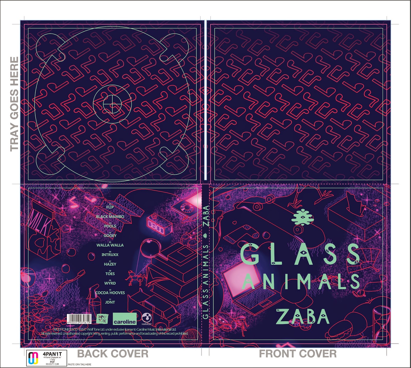
Referring back to some of my discoveries, we can see clear use of illustration in the design. Like many underground artists, Glass Animals also have referred to art to appeal to their target audience. The use of dark purples, reds and hints of greens abstract a scene of a jungle. Micah Lidberg, the artist of the illustration, used washes of watercolour. Lidberg is also the producer of the successful lyric music video Atlas by Coldplay.
It is stated by Boat Studio (who worked with Glass Animals to produce their album design) that the concept was originally inspired by a children's book The Zabajaba Jungle (1987), authored by William Steig. 
Its theme focuses on humorous stories, a variety of jungle animals and adventure. Dave Bayley (lead vocalist) shares his summary of the story as ''a beguiling story that lives somewhere between the strange and familiar, with its young lead slashing through creeper vines with his bolo knife and going where no human has ever penetrated. That's not just probably the best reference for the sound of the record, but a measure of the band's talent and ambition!". Now that I look back at some of the things the band has talked about their works in previous interviews, they mentioned that their lyrics are things that a child would say, and with the album design being inspired by a children's story, it shows the connection of the elements that took part in producing the album Zaba. Now I observe the album from a different point of view with the pieces of puzzles coming together. I think that, in a way, although the design looks somewhat sophisticated, there are some areas that seem rather childish, and I think that in both ways it clearly describes the type of music Glass Animals produce.
The contrasting titles aligned centre of the illustration contrast in its gold embossing. In fact, the gold-foiling lettering was originally hand-drawn by the band's frontman Dave Bayley himself. I think that having a member of the band take part in designing the album cover helps portray the type of music the album contains as Bayley shares his artistic style that most likely becomes a visual portrayal of his music. Additionally, having him design the font himself also helps the audience create a personal or closer connection with the band as the band's title and album's name are both drawn by the frontman himself.
Apart from the fact that the font is stylised by one of the members of the band, the title of the group is aligned in the middle of the canvas. Being embossed in largest letters gives it greatest attention from its audience amongst the rest of the elements. The gold somewhat plays along with the roll of being rich, although in this case it implies the richness of a jungle, such as its hidden secrets that only the main character in the book manages to reveal. Additionally, the eyes that can be identified when taking a closer look at the lettering also implies the carnivorous flowers and the petrified monster. Furthermore, it plays on the wording of the band's name Glass Animals. Its almost as if the title is alive itself, especially with its ability to interact with light and reflect it, which greatly attracts focus from passing-by customers.
The fact that the album's title is placed beneath the band's name shows that the band's identity is taking on the role of appealing to its audience. The capitalisation within all the lettering gives it greater attention when looking at it. Additionally, the fact that the lettering is decorated this way appears childish due to the decoration of the eyes hidden within the letters, like they'd be staring back at its customer viewing the product. The sans serif style shows that there is lack of professionalism, and tilts towards the children side, which helps the design further portray an impression of a child being the designer of the album cover when referring back to the original source of inspiration.
A small decoration has been placed atop of the band's name to balance out the design and play part in the concept of illustration that is used throughout the entire design. |
 |
| The back of the album also includes the illustration that has stretched throughout the entire product. This time, there is a featured track list of the album. It is also aligned in the centre along with the small print located at the bottom. It echoes the same balanced layout previously seen on the front cover of the album. Once again, the lettering is embossed in gold print, however due to the lettering being too small, there is no signs of the typical eyes hidden within the letters. However, being printed bold helps the wording stand out amongst the rest of the information. The fact that the list of songs isn't numbered plays along with the simplicity of the design. Alternatively, it helps the illustration to do most of the 'aesthetically pleasing' part of the design. If the text were to be too complicated, generally the design would look overcrowded, however the simple text atop of the busy illustration creates a balance between the two. The spacing between each song helps it to be identified as a separate work from each other, and perhaps the lack of numbered order may force the customer to look for their favourite song a few times, however throughout the daily routine they would have to go through in order to reach their song they will become familiar with the order of the songs, which may allow to form a closer connection between the customer and its product. The small print is positioned at the bottom of the design to allow to draw as much attention to the playlist as possible. It also allows the customer more space to admire the illustrative background of the design. The record labels that took part in the album are also given the honour of being embossed in gold, which may imply the importance of their roles, or perhaps it just helps to sustain the controlled theme of the overall design. |
 |
| The album includes a large-scaled print of the original artwork by Micah Lidberg that can be posted on the wall. If we look closer, the CD is also decorated in the similar style of the illustration, but being limited to just a single, looping pattern with gold lettering and no-differing font. The concept of dark, peculiar illustration is sustained throughout the entire design. |
 |
| Poster comes in with the album - illustration by Micah Lidberg. |
 |
| Glass Animals' official website continues the same design of the illustration and gold lettering of the album. Additionally, it has a feature where guests can zoom in or out on the detail of the illustration, being able to observe the busy elements on a large scale. The producers of the website are known as She Was Only, and independent company located in London, who design their works around the principles of simplicity, clarity and elegant problem-solving. Like stated, the website seems to be filtered from distraction that has added focus, therefore commanding attention. |
Now that I look back at some of their other music videos, I believe that the design of the album definitely reflects on the type of music Glass Animals produce. The use of play dough to recreate scenes to portray a song can be relatable to the concept of the design. The material itself is very common amongst children, and the illustrated storybook The Zabajaba Jungle definitely had a heavy impact on the music videos. I believe that within them, they attempt to recreate certain moments from the book with some of their own interpretation, resulting in a unique combination of the two that sums up Glass Animals just right.
 |
| Looking at other works by Glass Animals, they also have Gooey EP, which includes their successful track Gooey along with some remixes done by other artists. In this case, the format is a heavy vinyl, however, the overall design is similar in many ways to the debut album Zaba. In the previous design, the illustration was done by Micah Lidberg. For this design, the illustrator is a French student studying design, illustration and digital art. Marthe de Laforcade was given the opportunity to design the art for this EP. At first, I believed that both illustrations were completed by the same artist. However, I can now see how Glass Animals like to create their identity. The style is bold and rich in colour and patterns that easily tames attention. I believe that this sort of style of graphic design is common amongst young adults, especially students, and I think that working with similar-aged clients helps the band attract their similar-aged target audience as they share similar tastes. The use of gold is featured once again, where the outside sleeve contains the band's logo in same style as Zaba album. Only this time, the small decor seen at the very top of the alignment on the debut album is enlarged and die cut on the vinyl packaging format, revealing a heavy-patterned gold-embossed sleeve that stores the vinyl. The golden eye that looks through this small symbol relates back to the album being 'alive' or a creature lurking through the illustrated jungle. |
 |
| The back of the packaging continues with the bright illustration, just like previously in Zaba. Once again, the track list is aligned centre to echo the balance on the front cover. The lettering is bold and capitalised but lacking hidden animal eyes. In this case, the credit to the artist who remixed the song is placed beneath the work in brackets and skinnier lettering than the song's title. This way, the linked information is still given some sense of separation between the two. The small print is also in gold embossing, placed at the bottom of the design to offer the best view of the illustration and greatest focus on the playlist. This is also centred to form a well-controlled design and form a strong connection between the elements. |
Final music video for Gooey (2014)
A second music video for the track Gooey again follows a similar concept to the lyric video. The element that makes the two music videos different is the artist responsible for the illustration. Additionally, this music video is only there to decorate the official audio video, whereas the previous one includes the lyrics of the song. However, elements, such as the effect of warping, are added to the panning illustration to create that hypnotising mood along with the song. Furthermore, we see the band's logo throughout the entire video, and we get to see the logo coming to life. The eyes that decorate the logo on the album get to come alive and blink at its audience as if to stare back. Additionally, the lettering seems to somewhat wiggle, which further implies the logo coming to life.
I believe that how Glass Animals have decided to introduce themselves to the music industry is just right. Amongst the many underground artists, I believe that the trending associations of art and music are great combinations as, I believe, in a way they correspond each other even if their formats are completely different. Which is why I think that the fact that Glass Animals are promoting themselves heavily depending on the illustration shows that they enjoy displaying their talent through both formats; through sound and through visuals. Thinking further, I see their music works as art itself, and using physical art to support this shows they wish to be identified as artists within the music community. With this knowledge, I believe that illustrating my own version of the album Zaba is just as important to attract the right target audience and at the same time bring out the true identity of Glass Animals.
Planning: Designing the CD Digipack
I decided that, with the overall understanding of the codes and conventions amongst underground artists, it is finally time for me to generate some of my own ideas for the CD Digipack design for Glass Animals. Although their album Zaba already has a very outstanding design, I may refer to their design at times to remind myself how my selected band has promoted their album.
Powered by Typeform
I formed an online survey using an online survey builder named Typerform. This tool helped me create a survey that was able to upload image files as options for the questions. I was unsure of the composition and the colour scheme for my final graphic design, so I linked the survey to my target audience to see which options did they like best and recreate the design according to the most popular answers amongst them.
The results for the colour palette that I got were quite varied compared to the composition. I think that what the audience really enjoyed is how the elements were organised in a portrait manner, and I think that I'll keep this in mind when it comes to designing the art.
Construction of Final Graphic DesignThe results for the colour palette that I got were quite varied compared to the composition. I think that what the audience really enjoyed is how the elements were organised in a portrait manner, and I think that I'll keep this in mind when it comes to designing the art.
In the end, I decided to go with the concept of a digital graphic design inspired by the illustrator Micah Lidberg (artist of Glass Animals' album Zaba). I believe that continuing to illustrate Glass Animals' products will maintain their illustrative identity and continue to appeal to their target market.
I wanted to link the design to my idea for my music video, which is miniature pets exploring an ordinary house, so I thought of focusing on an area where many things can be found around the house. I decided to illustrate different ordinary household items placed on a large table - items included headphones, coffee, books, et cetera, et cetera.
I decided to stick to a fixed angle to give the drawing some sort of control, as when observing Lidberg's works, many seems to be very in order. I chose to give the viewer a two-point perspective of the table, as I felt it is the most comfortable to the eye for this case. I used a protractor to draw out guidelines stretching at a 30 degree angle across the paper to help me with the perspective of the items. I sketched out the rough design in pencil.
I decided to add some random things along the ordinary items to give it some twist to the design. I decided not to worry about the scale too much, as I thought it would give the design an interesting feel to it.
I decided to add some random things along the ordinary items to give it some twist to the design. I decided not to worry about the scale too much, as I thought it would give the design an interesting feel to it.

I then had the design scanned so that I could upload the image onto Photoshop and begin editing the design into a graphic version.
 |
| The sketch came out very grey and hard to see, so I had to apply a few changes to the work before moving on. |
 |
| From the menu, I selected Levels so that I could adjust the contrast of the picture. |
 |
| I had to darken the pencil, so I dragged the marker on the far left of the diagram and moved it towards the right to darken these parts of the image. |
I found out that even with the guidelines, it was difficult to maintain the right angle at all times, so I decided to add an isometric layer to help me with the perspective. I set the layer's opacity to multiply so that the original sketch would show through the lines.
I didn't find the pencil version easy to follow, so I quickly traced the design using the brush tool on a new layer.
Before starting to work on the line art, I changed the colour of the new sketched version of the design to red so that this contrast between the black brush and the red will help me focus on the right layer, as I would get confused with both layers being drawn in black.
To start drawing out the line art, I created a new layer and made sure that it sat above all other layers. I then set my brush settings to a suitable form for the lines to be drawn on top of the design - these adjustments will affect the pen tool that I'm going to use.
 |
| I settled with 100% hardness so that the lines are crisp, and decided to go for 3 px as I feel that it is the right thickness to outline the art. |


 |
| Before, a lot of the line art overlapped with each other (such as the leaves of the potted plant), and it looked like a mess. |
 |
| After going over with the rubber tool, I was able to clean up the design and give the objects their true forms. |
 |
| Final line art. I think although this was my first attempt at producing this type of drawing, I believe that it has turned out okay. Although Lidberg's designs are much more crowded, I don't illustrate graphical drawings professionally, whereas the artist does. And even with little experience in this field, I believe that the result is something I think I'll be able to work with to produce the art for the CD Digipack and the Magazine advertisement for Glass Animals. |
 |
| During the colouring process, I was really struggling with my palette; the colours didn't seem to cooperate together very well for this piece. Instead, I looked back at some of Micah Lidberg's art and decided to go for a very simple yet vibrant and came across this work. I settled for this colour scheme of purples and pinks, and also attempted at some similar patterns, such as the mist and the occasional waves. |
Unfortunately, half the time I wasn't able to work properly without the software slowing down its performance when screen recording via Quick Time Player, so I was only able to include snippets of the process.
 |
| Final product |
I think that changing the colour scheme was the right thing to do as the previous palette didn't seem to fit the picture. I wanted to form a dark yet comforting atmosphere within the art, which may explain the glow effects I added to some elements that may give off light. I like the chaos involved in the art, and how it is very busy with detail. I think that for Glass Animals' audience, it is suitable due to the ordinary items spread across the table surface that young adults or teenagers may enjoy.
I wanted to make the design quirky, however, and decided to include some out-of-place objects too, such as the chicken at the very top of the illustration. In addition to this, I wanted to give the picture a hint of recklessness to help the youth relate in a different way, such as the magnifying glass and the ant that many of us might have done in our childhood.
I didn't pay attention too much to the scale of the objects, as I thought this would give the image an interesting play on the different elements in the picture. In a way, I feel that it relates to the concept of the music video, how the miniature glass animals turn into miniature real life animals, and the image may act as a sneak preview of the setting, or perhaps exhibit the animals' environment within the house.
I think that although the colour scheme makes the art eye catching, it might turn out to be too bright for the band, as usually their designs are calmer with their brightness of the colour, and I think that the art almost seems to fit a different genre of music, such as electronic or house, that audience may listen to at clubs.
I also think that I could have overlapped more with the objects within the image, and it may have helped get rid of the negative space that may trouble the concept of the place being chaotic.
Originally, I was going to include the casted dog and two cats within the art, however as the production moved on, the cast was beginning to change, so I had to settle with no pets within the design in case there were actual changes made.
"Flip" Glass Animals Completed CD Digipak

Because the original art is in the format of an A4 paper, I was able to zoom in on certain areas of the art to crop to the square panels and match the packaging. Fortunately, because the art was done in large dimensions, I was able to zoom in and crop on areas without the graphics being pixelated, and it gave me sharp quality of the detail.
I decided to feature two zooms of the art for the front and the back, but different areas of the table to give the customer more to look at than being restricted to one crop of the image. However, there wasn't enough art to display different areas for the inside of the packaging. I didn't want the art repeating as the customer may be somewhat disappointed in seeing the same art when they open the CD. I wanted to live up the product to their expectations and surprise them with something new, so I quickly created the musical note pattern (forming a link between the art and the music) that follow the colour scheme of the design. This way, the two illustrations related and showed a smooth transition when viewing the product.
I kept the simplicity in this pattern because I believe that there isn't much important information to hold, which is why it seems rather empty on the inside. However, I think that the repeating of the musical notes isn't enough to give the overall design a good transition from the outside to the inside of the product. I think that to make the design better, I would have instead done a pattern based on the everyday items that may be found around the house, helping the design link back to the art.
I also think that the brush's settings didn't match those used for the graphical illustration. The brush seems much bulkier, making the style slightly stand out when compared to the art on the outside. I thin I should have been more careful with this too, as now the pattern looks larger, like it has been zoomed in, and lacks detail.
When I aligned the logo centre on the front, I noticed that something was missing, and realised that I forgot to include the small decor and the album's title. I had to quickly recreate these, and when I did manage to finish them, I centred these so that the overall design felt in control and structured just like the art behind it. I wanted the band's logo to be the largest so that when the customer picks up the album, the first text they hopefully read is the band's identity, followed by the album's title.
I also noticed that the yellow somewhat blended with the pink light radiating from the laptop's screen in the art, so I decided to add some shadow to the logo so that it not only helped the yellow text stand against the pink, but also make the entire logo seem to hover above the art. I didn't want this to be too obvious though, so the opacity for the shadow is only around 50%.
For the spine, I rearranged the elements on the front cover and lined them up to fit them along the narrow area. This time, I decided to use the decor as a separator for the two pieces of information. Once again, band's name comes first, followed by their album's title.
For the small print on the bag of the digipak, such as Glass Animals' record labels and the barcode, I placed these at the bottom of the panel to give the playlist as much space as possible so that it is made readable for the customer.
I went for a simple font for this set of information (avoiding claws on the lettering to loose the formality), using capitalised style for the songs to be easily readable, and also match the style of the information on the front cover. I believe that the style for the logo of the band and the title of the album look somewhat childish, and so settled for a font that a child would most likely write in.
I wanted to add the numbers of the songs, so I had these sit atop of the titles, smaller and somewhat noticeable. I didn't want them to be too large and distract the reader from trying to take in the track list when looking. I think that including the numbers makes it easier for the customer to know which track to skip to when wanting to listen to a certain track that they like. It saves them time from having to count down the track list and determine the number themselves. This is something I myself have experienced and know that it is difficult looking at the track list when you wish to skip to your favourite song and have to count down to the track on the album before skipping to that track on the CD. Which is why I numbered the playlist on this design so that customers don't have to go through the same process when trying to enjoy the band's music.
I was unable to decide on the colour of the information, so I produced three potential variations of colour; green, blue and orange. I think that the blue design allows the information to stand out, but it seems almost too bright and out of place for the heavy pinks and purples in the art. For the green, I feel that there is no collaboration between the colours in this combination In the end, I decided to settle with the original orange that I planned to use. I think that it goes best with the pinks and purples in the background and seems to cooperate well together. The art seems almost electrifying, whereas the orange softens the mood with its more gentle tone.

Additionally, settling for the yellow text may help Glass Animals continue maintaining their identity as previously they have featured their logo in similar yellow shade. This will ease the process of identifying the band for the customers as the elements will be quicker to catch on if they're of matching colours.
Overall, I believe that the design is suitable for Glass Animals and its audience. I think that the art itself helped the design make it look like it belongs to an underground artist, as from my studies I noticed how many individual artists in the music industry used art to decorate their work as well as form their unique identity. Here, I believe that I have kept the band's identity as I have illustrated a work inspired by the music video's idea and followed Lidberg's art to produce similar packaging to previous designs.